Old figure
Data (Old data)
Warning: The following should not be taken as a finished scientific study, although it could be understood as the first part of one. It has some verifiable data taken from acknowledged sources, phenomenological descriptions, working hypothesis suggested by the data that could constitute the basis of further research, which could be accepted or rejected and with additional consequences that could be explored, speculations, loose ends, questions and opinions. All of these are present in any real-life investigation, although most of them should be distilled or eliminated before reaching a scientific publication.
The presidential elections in Mexico took place a few days ago and the preliminary electoral results program (PREP from its acronym in Spanish) made the partial data available to the general public as they were processed. During the night on election day I made a small computer code to capture that information each 5 minutes (plus the time required to get an answer from the server) Here and here I keep copies of the captured pages. It is from them that I extracted the information presented below, although they have much more information that may prove useful.
A friend (Guillermo Barrios del Valle, thanks!) helped me organize the first e-mails received regarding this page. You can find them here chronologically ordered or as threads. Furthermore, he organized a blog.
Note:Alfonso Baqueiro (his mail is here and his blog here) wrote a program very similar to mine. Fortunately, he started collecting data earlier and finished later than myself. Very kindly, he sent them to me, allowing me to redo the figures contained in my original web page. For the curious, close to each figure I added links to the old figures and to the new and old data. Thanks Alfonso! I also want to thank the many readers of this page which have sent me data. Unfortunately, I have been unable to include them yet.
Figure 6 is now ready.
Another aspect that caught my attention is the absence of fluctuations, although that might be normal (see below).
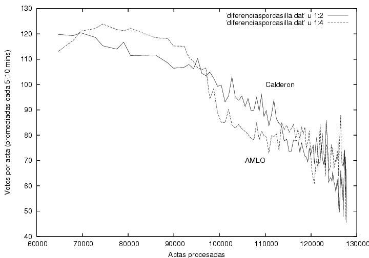
Finally, it is peculiar that AMLO's upwards trend, which was constatn during 70% of the counting process was rapidly reverted afterwards. However, this might be explained assuming that the rural vote were mostly in favor of the Revolutionary Institutional Party (Partido Revolucionario Institucional, PRI) and that it started to arrive at the counting offices close to 2AM. Another possible explanation could lie in the late arrrival of the votes from the North-East, delayed due to the time-zone differences.
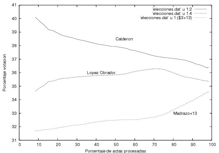
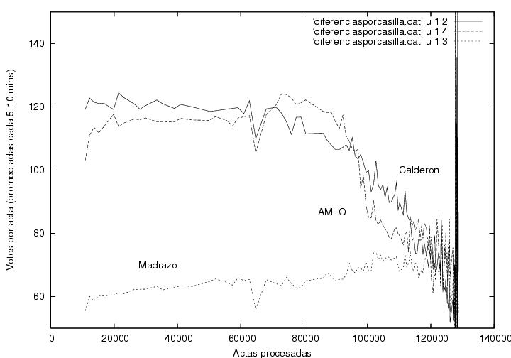
Warning:The curve corresponding to Madrazo was modified by adding 13% to it in order to display it in the same plot. Thus, the reader should substract 13% from the value read in the vertical axis.
Fig. 1
Old figure
Data
(Old data)
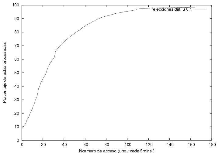
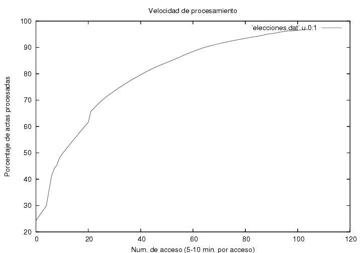
Figure 2 indicates the speed of reception and processing of certificates. The horizontal axis corresponds to the certificate's sequential capture number. My program was designed to take a photograph of the web page of the PREP each 5 minutes, though it took between 5 and 10 minutes due to the saturation of the system. The vertical axis shows the percentage of certificates processed. Clearly, there was a noticeable desacceleration in the speed of reception and processing which could be explained through the delayed arrival or the rural vote (see above). Close to the 31-st datum (corresponding to the 42-st access (the numbers differ as I discarded repeated data, i.e., data captured before an update at the PREP site)) close to 1:01AM, there is a small jump. This is due to the failure of the PREP to update its page during about 20+min. After that, the processing speed slows down. Shortly after, AMLO's data display a maximum and start descending. Before the small jump the behavior is approximately linear, while later it decreases gradually. A tentative explanation is that at the beginning of the process the certificates arrived at a speed higher than the capacity of PREP to procees them. Thus, a queue was formed. Until 1AM, PREP would be working to its maximum capacity, which we can estimate from the slope of the linear region. From the copies of the PREP pages we may infer that from 21:30 and until 1:01 close to 70,000 certificates were processed, so that the processing capacity of the system is about 330 certificates per minute. As there were 300 electoral districts, this means that each office processed about one certificate per minute. Afterwards, as the certificate arrival rate slowed down, the arriving certificates would be processed immediately upon arrival, and the speed displayed in the figure would become simply the average arrival rate.
Fig. 2
Old figure
Data (the same as in Fig. 1)
(Old data)
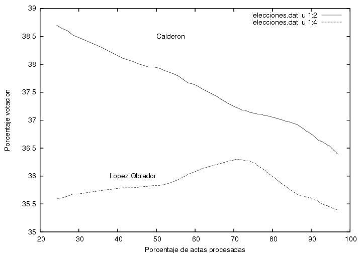
Fig. 3
Old figure
Data
(Old data)
Fig. 4
Old figure
Data
(Old data)
Fig. 5
Old figure
Data (the same as for Fig. 3)
(Old data)
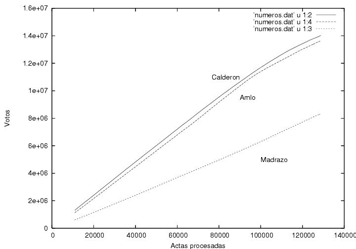
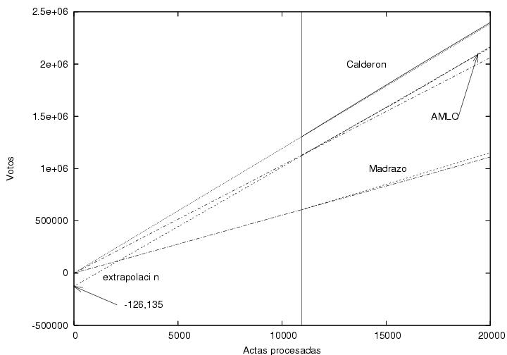
In this figure I display the initial data of Fig. 3, corresponding to the first 20,000 certificates captured. The vertical line indicates the start of my collected data (at 10493 processed certificates). Towards its right the data corresponding to the main candidates is displayed. The three of them show a linear tendency, apparently without fluctuations, due perhaps to the large number of votes accumulated (about one million). To the left side of the vertical line I added three straight lines (unlabeled) that start from the origin and end at the first data point of each candidate. I extrapolated those lines towards the right hand side of the plot in order to compare them to the actual data. In the case of Calderon, the data of PREP and the corresponding straight line that starts from the origin are almost indistinguishable. In the case of Madrazo, there is a slight difference, which suggests that his votes per certificate were gradually increasing in time. This observation would be qualitatively consistent with Fig. 4. On the other hand, the straight line corersponding to AMLO drifts away much more rapidly from the data of PREP. This suggests that during the first 10,000 certificates the number of votes for AMLO must have been significantly less than subsequently. The initial slope corresponding to AMLO would have to be significantly smaller than the later slope, as obviously the data would have to meet the origin. Nevertheless, it is interesting to make an extrapolation of AMLO's data. I extrapolated a linear fit to the data in the interval [10,000:20,000]. The y-intercept is around -126,000. Curiously, this number is very close to (minus) the total number of electoral booths. The following figure (Fig. 7) is the same as Fig. 6 but extended up to 70,000 certificates. Strangely, the linear fit performed with data from only the interval between 10,000 and 20,000 is practically indistinguishable from the corresponding results from PREP over the whole range.
In a very speculative and conspirational scenario, this observations could be interpreted as follows: One vote for AMLO could have been substracted in the initial phase of the counting process for each of the 130,000 electoral booths. Surely, other explanations could be found. It will be interesting to know why the votes from the first 10,000 booths was so different from that of the following 60,000, which we had seen in Fig. 5 is very different to the subsequent ones. It is urgent to obtain and analyze the data corresponding to the first 10,000 booths. A reader of this page has manually obtained data starting at 8:00PM. They are here. As soon as I find the time, I will try to add them to Fig. 6.
Fig. 6
Data (the same as for Fig. 3)
Fig. 7
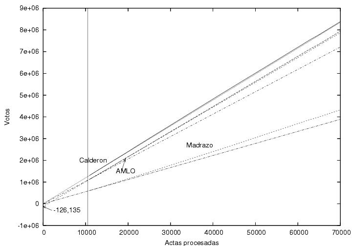
Data (the same as for Fig. 3)
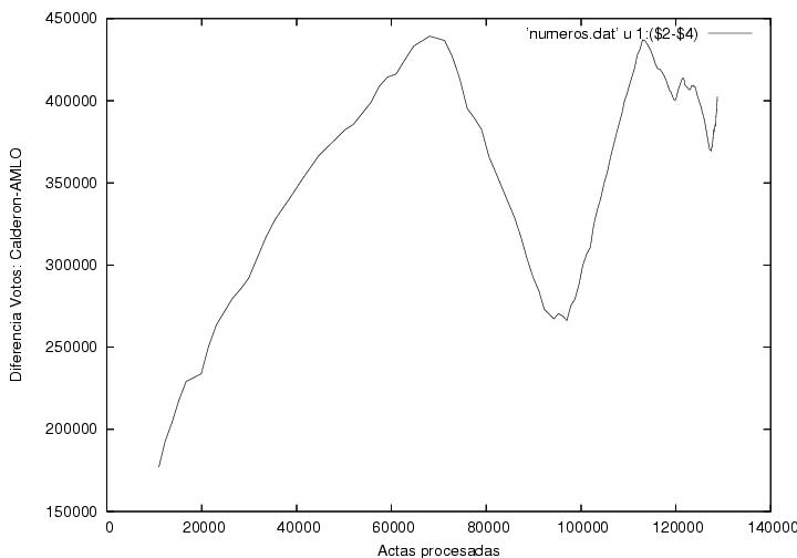
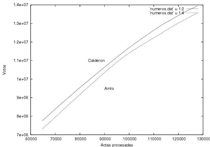
Some questions raised in the first version of this page can be answered now that we have more data. For example, the initial numerical advantage of Calderon over AMLO in the first processed booths was not as large as could have been supposed from its large percentage lead. Rather, it was gradually built up during the first 70,000 certificates processed. We must not forget that a percentage is obtained from a quotient and that it can be large if the numerator is large, but it is also large if the denominator is small. Nevertheless, the new data produce new questions.
If I understand correctly, the results of PREP arrive in an order determined mostly by the accesibility and communication facilities. Thus, the data from large cities would arrive efore the small cities, and these before those from rural communities. Nevertheless, I wouldn't expect an effect from other geographical nor socioeconomical class. Therefore the question remains open: Are the data presented above normal and to be expected? What is their explanation? Are they consistent with previous election results?
It is important to remark that the election is defined by the final value of the vote count, and that the intermediate leading candidate during the vote count is only circumstantial, without value. If the same certificates were to be processed in a different order, the identity of the intermediate leading candidate might easily be changed during part, or even, during most of the counting process. Nevertheless, his identity does have a psychological and strategic value, as it strengthens the image among the citizenship that there is a well established winner from the beggining. As a matter of fact, the night of the election, the candidate from the National Action Party (Partido Accion Nacional, PAN) argued that he had been above his opponent during the whole process, as if this information irrefutably proved his triumph. This argument has been repeated subsequently in the media. The implication is, obviously, false.
If you wish to comment on this page, please send a message here or, better yet, add a comment to the blog. You can read the messages received previously here, chronologically organized or as discussion threads.