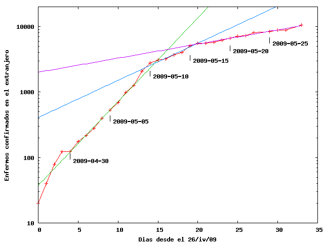
I made a table with data from the bulletins issued by the World Health Organization. It is a simple task to make a semilog plot of the cumulative number of confirmed infections outside of Mexico.
A straight line in this plot corresponds to an exponential growth. There seem to be three exponential regions, each with a growth coefficient than the previous. The first one spans from the fourth to the twelfth days in the plot, that is, from April 30 to May 8. Here, the number of confirmed cases grew exponentially as $exp(b t)$, where $b=0.294+/- 0.005 days^{-1}$ and t is time. From here we may infer that the doubling time is barely 2.35 days. Abruptly, the behavior becomes a different exponential after the thirteenth day, May 9, with a different coefficient $b=0.13+/-0.011 days^{-1}$, less than half than the previous one. ¿Why? The doubling time increased to 5.3 days. After the 20-th day, May 16, the slope has another abrupt change, with a smaller still coefficient $b=0.049+/-0.002$ correspondint to a doubling time of 14 days. Two abrupt changes of slope in a plot that has data from all around the world seem quite surprising. I would have expected a rather smooth change. What could have synchronized this worldwide change? Of course, the data are dominated by the US, but it is still strange that the data from all around such a large country change behavior abruptly. Could it have been some centralized change of policy?
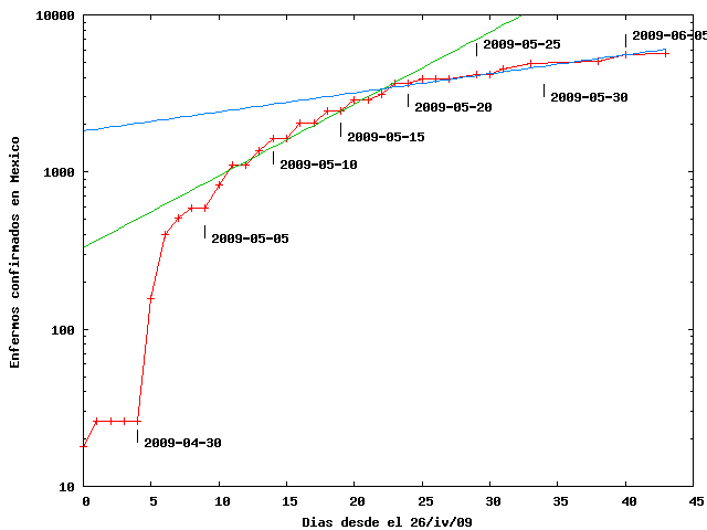
The number of confirmed infections reported by Mexico can be seen in this second plot
The number of cases before May 2 seem erratic and I believe they are not too trustworthy. nevertheless, afterwards they can be fitted by an exponential with coefficient $b=0.105+/-0.005 days^{-1}$ corresponding to a doubling time of 6.6 days, close to that of the rest of the world. The data seem slightly convex, as if $b$ diminished smoothly in time. Nevertheless, on May 19 there is an abrupt change and the slope becomes $b=0.029 +/- 0.003 days^{-1}$, corresponding to a doubling time of 23 days.
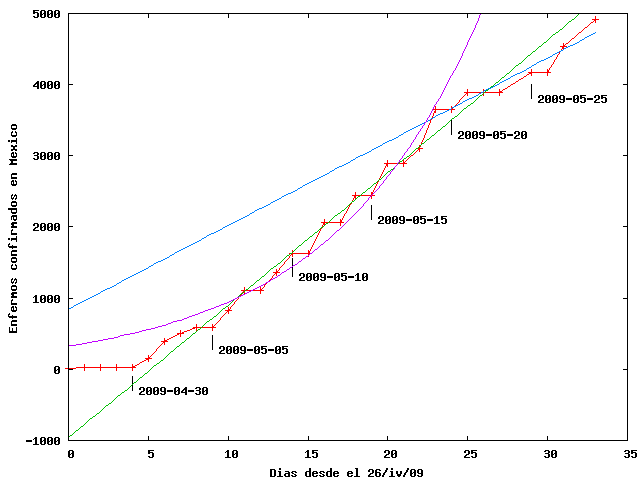
Trying to understand the abrupt lengthening of the doubling time, I plotted the same data but not in a semilog scale but in a linear scale
Here I show the data reported to the WHO by Mexico, the same exponential fit to the data from May 2 until May 19 as shown in the previous plot, a linear fit to the same period and a second linear fit after May 19. Although it may be somewhat embarrassing to admit, the data in this plot look more like a couple of straight lines than a couple of exponentials as stated previously. The first line has a slope $m=186 +/- 7$ infections/day while the second one has a slope $m=118 +/- 13$ infections/day. The obvious question is: why do we get a linear behavior in the initial phase of an epidemic?. The second question is: why is there an abrupt change of slope? My hunch, totally speculative and unfounded is that a linear behavior might correspond to a diagnostic system that has been saturated since the beginnings of May, in which case, the slope is a measure of the capacity of the country for diagnosing swine flu and is unrelated to the number of cases that have actually appeared, which could be expected to be much greater and unknown.
The abrupt change in the slope in May 19, corresponding to a decrease of about 30%, would then correspond to a loss of diagnostic capacity, maybe due to the failure of one out of three similar diagnostic labs. If the diagnostic system were saturated, as the data suggests, the decrease in new confirmed cases could mean that the Mexican health institutions have chosen a first in first out (FIFO) protocol and that new cases are waiting in a queue that gets longer each day so their diagnosis has not been confirmed; it would not mean that the epidemic has been subdued, as mexican goverment propaganda has tried to imply. That is, every day there is a longer delay between infections and their confirmation and that might explain the diminution in the number of recent confirmed cases.
The number of infections in all of the world are in the following plot
This plot appears to be exponential until May 15 and linear afterwards. Speculating as above, it could have happened that the diagnostic system are saturated worldwide, o at least, within the US, which has the fastest growth with about 500 new cases each day. Ultima versión